EroMe
Sexy Adult Directory | EroMe
Erome.com is a website that's been around since 1998, which is a really long time. It's a mix of a regular porn site and a place where people can share their own photos and videos. They get a lot of traffic, with 12 million views every month. At first, it seems like they have a good idea and a decent selection of content. But let's take a closer look to see if they actually pull it off. The site has been able to stick around for 21 years, which is pretty impressive. I'm curious to see what makes it so popular and if it's worth checking out. With a concept that's a bit different from other porn sites, Erome.com might be onto something. But does it live up to its promise, or is it just another site trying to make a name for itself?
The website is really simple to join and get started with. I also love how it looks at night, the design is great for browsing in the dark.
When you first arrive at the site, you'll need to create an account - but don't worry, it's completely free. I found it really easy to link my Reddit account, it only took one click and I was all set. However, you do have the option to sign up using your email or other social media accounts if you prefer. Just a heads up, if you do decide to use your Reddit account, it will use your Reddit username, so bear that in mind if you have any personal info associated with it. Once you've completed the sign-up process, you'll be taken straight to the front page, where you can start exploring.
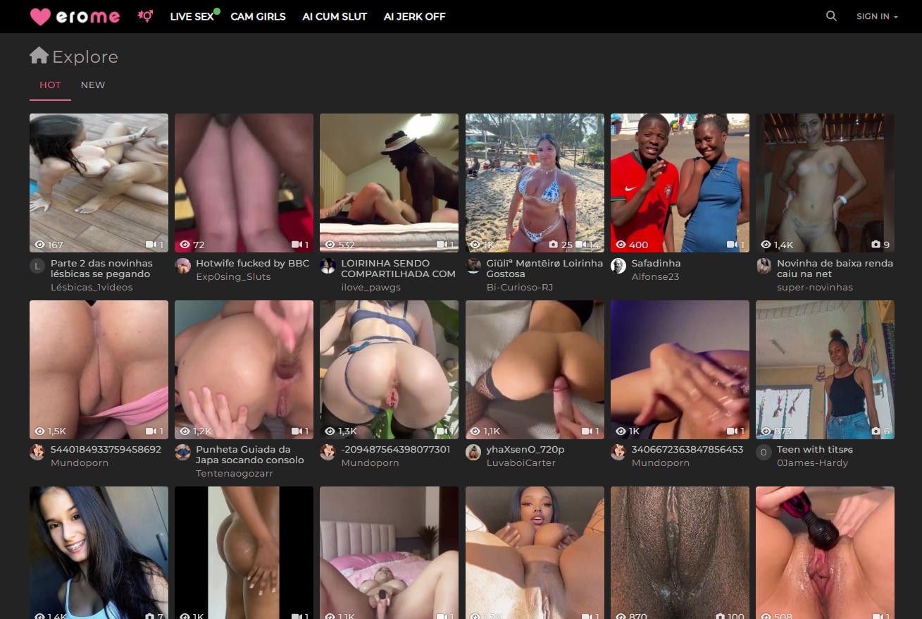
The website has a pretty basic design. It's got a black background and white text, which makes it easy to look at when you're browsing at night. The main part of the site, "Ero Me", has a bunch of preview pictures lined up down the middle. The sides are empty, except for the headers at the top that you use to navigate. These headers say "Home, Feed, Saved, Profile, Upload, and Settings" - it's all pretty straightforward. There's also another menu on the right-hand side, but you can ignore that for now. It just has a bunch of links that take you to other websites. Overall, the layout is clean and simple, which is nice.
Simple and Minimal Design Makes Navigation Easy
When you're on the main page, you can sort the content by what's "Hot" or "New", which gives you a bit of control over what you see. However, it would be really helpful if you could filter out videos from pictures, or vice versa, but at least the preview gives you an idea of what you're getting. The preview shows you the first image in a gallery, or the opening scene of a video, which is a good starting point. If a preview has multiple images, they'll flip through them quickly if you hover over it, and you can also see if a gallery has a mix of videos and pictures by looking at the bottom right corner of the image. You'll also see the name of the gallery at the top, and the user who posted it at the bottom. One thing that's missing, though, is more sorting options - it would be great to have a bit more flexibility in how you can browse through the content.
I've got a bit of a complaint about the previews, though. The text is really hard to read - it's white with no borders, so if there's anything white in the background, you have to strain your eyes to make out what it says. But honestly, it's not a massive issue. What really makes up for it is the cool little slideshows that pop up when you hover over something with your cursor. That feature alone is a total winner.
If you're looking to explore the site, you can start by using the search bar at the top. However, it's worth noting that it might take some time to get familiar with the site and its features before you can make the most of it. You can't simply search for popular adult film stars, for instance. Instead, you'll need to get to know the community and the popular contributors. Once you find a gallery that catches your eye, just click on the preview, and you'll be taken to a page filled with photos and videos. From there, you can scroll through and check them out at your leisure. The site is also considerate of image formatting, automatically resizing pictures to full size, so you don't have to worry about that. Additionally, they've implemented a feature that enhances the display of vertical images by adding a blur effect where the black bars would normally be, which is a nice touch. While I'm not exactly an expert in image editing, it's clear that the site is making an effort to provide a more enjoyable user experience.
Unique Feed Feature Lets You Curate Your Own Porn Page
This site has some really cool features that set it apart. For instance, you can follow a poster and see all their new uploads in your feed tab, kind of like on other social media platforms, but with adult content. It's actually pretty great because you can customize your feed to fit your preferences perfectly. If you want to see more from a particular poster, you can check out their profile to get an idea of the type of content they usually upload and how often they post. Plus, you have the option to save or download any pictures or videos directly from the site, which can be really convenient.
I think there are a few things that would make the galleries even more amazing. For one, it would be great to have slideshows - you know, where the pictures just automatically move from one to the next. And another thing that would be really useful is if we could use the arrow keys to navigate through the pictures. That way, you could just sit back, relax, and look through the gallery without having to click on anything. You could even just use your keyboard to go through the pictures, which would be really convenient. But overall, I think the site is really great just the way it is. If they could just add those two features, it would make it almost perfect. Being able to navigate through the gallery without having to use your hands would be really freeing - you could use your hands for other things, like eating a snack or something. Anyway, I think the site is awesome, and with those two additions, it would be even better.
Awesome Mobile Site!
The mobile version of the site is a big improvement in some ways. For one, you can swipe through photos easily, which is a nice feature. However, you still can't enable slideshows, which is a bit of a drawback. On the other hand, the mobile site is really well-designed and user-friendly. All the features from the desktop version work seamlessly on mobile, and everything feels like it's been optimized for a smaller screen. It's easy to get around, look through galleries, watch videos, and save images. The videos play smoothly, without any buffering or issues, just like on the desktop site. Overall, the mobile site is a great alternative to the desktop version, and it's definitely worth checking out. In fact, it's like discovering a hidden gem - it's similar to the desktop site, but with some nice surprises that make it even better.
ThePornDude’s Favorite Features
I really like the way erome.com has a social media style feed. It's a great feature that sets it apart from other porn sites. What I think is really cool is that you can customize your own feed with amateur content that you actually want to see. You don't have to waste time scrolling through stuff that doesn't interest you. Instead, you can pick and choose the best of the best - the girls that are really gorgeous and fit your type perfectly. It's a game changer, if you ask me. Being able to tailor your experience like that is a major plus. You can just sit back, relax, and enjoy the content that you love, without any hassle or annoyance. It's definitely a feature that makes erome.com stand out from the crowd.
I think the gallery page is really well done, despite a few missing features like arrow keys and slideshow functions. It's great that the images are already enlarged and edited, making it easy to view them. Plus, the site has very few ads, which is a huge plus - you can click on the images and save them without being bombarded with annoying redirect ads. Overall, the user experience is excellent, making it incredibly easy to use and enjoy the content.
ThePornDude’s Suggestions
I think erome.com is a great site, but it could be even better with a few tweaks. For instance, adding categories or tags would make it so much easier to find specific types of images. Right now, you have to kind of browse around and hope you stumble upon something you like. But if they had tags, you could even take it a step further and allow users to exclude or include certain tags in their feed, which would be really cool. It's not that the site is bad as it is, it's just that there's always room for improvement, you know? Maybe with a few adjustments, it could be even more user-friendly and fun to use.
ThePornDude’s Final Thoughts
If you're into amateur adult content and enjoy the social aspect of a website, I'd definitely suggest checking out erome.com. They have a huge collection of galleries that are really impressive, with a wide range of fetish content and attractive amateur models. Both the mobile and desktop versions of the site are well-designed, so you can access it from whichever device you prefer. Give erome.com a try - you might be pleasantly surprised.
The website is really simple to join and get started with. I also love how it looks at night, the design is great for browsing in the dark.
When you first arrive at the site, you'll need to create an account - but don't worry, it's completely free. I found it really easy to link my Reddit account, it only took one click and I was all set. However, you do have the option to sign up using your email or other social media accounts if you prefer. Just a heads up, if you do decide to use your Reddit account, it will use your Reddit username, so bear that in mind if you have any personal info associated with it. Once you've completed the sign-up process, you'll be taken straight to the front page, where you can start exploring.
The website has a pretty basic design. It's got a black background and white text, which makes it easy to look at when you're browsing at night. The main part of the site, "Ero Me", has a bunch of preview pictures lined up down the middle. The sides are empty, except for the headers at the top that you use to navigate. These headers say "Home, Feed, Saved, Profile, Upload, and Settings" - it's all pretty straightforward. There's also another menu on the right-hand side, but you can ignore that for now. It just has a bunch of links that take you to other websites. Overall, the layout is clean and simple, which is nice.
Simple and Minimal Design Makes Navigation Easy
When you're on the main page, you can sort the content by what's "Hot" or "New", which gives you a bit of control over what you see. However, it would be really helpful if you could filter out videos from pictures, or vice versa, but at least the preview gives you an idea of what you're getting. The preview shows you the first image in a gallery, or the opening scene of a video, which is a good starting point. If a preview has multiple images, they'll flip through them quickly if you hover over it, and you can also see if a gallery has a mix of videos and pictures by looking at the bottom right corner of the image. You'll also see the name of the gallery at the top, and the user who posted it at the bottom. One thing that's missing, though, is more sorting options - it would be great to have a bit more flexibility in how you can browse through the content.
I've got a bit of a complaint about the previews, though. The text is really hard to read - it's white with no borders, so if there's anything white in the background, you have to strain your eyes to make out what it says. But honestly, it's not a massive issue. What really makes up for it is the cool little slideshows that pop up when you hover over something with your cursor. That feature alone is a total winner.
If you're looking to explore the site, you can start by using the search bar at the top. However, it's worth noting that it might take some time to get familiar with the site and its features before you can make the most of it. You can't simply search for popular adult film stars, for instance. Instead, you'll need to get to know the community and the popular contributors. Once you find a gallery that catches your eye, just click on the preview, and you'll be taken to a page filled with photos and videos. From there, you can scroll through and check them out at your leisure. The site is also considerate of image formatting, automatically resizing pictures to full size, so you don't have to worry about that. Additionally, they've implemented a feature that enhances the display of vertical images by adding a blur effect where the black bars would normally be, which is a nice touch. While I'm not exactly an expert in image editing, it's clear that the site is making an effort to provide a more enjoyable user experience.
Unique Feed Feature Lets You Curate Your Own Porn Page
This site has some really cool features that set it apart. For instance, you can follow a poster and see all their new uploads in your feed tab, kind of like on other social media platforms, but with adult content. It's actually pretty great because you can customize your feed to fit your preferences perfectly. If you want to see more from a particular poster, you can check out their profile to get an idea of the type of content they usually upload and how often they post. Plus, you have the option to save or download any pictures or videos directly from the site, which can be really convenient.
I think there are a few things that would make the galleries even more amazing. For one, it would be great to have slideshows - you know, where the pictures just automatically move from one to the next. And another thing that would be really useful is if we could use the arrow keys to navigate through the pictures. That way, you could just sit back, relax, and look through the gallery without having to click on anything. You could even just use your keyboard to go through the pictures, which would be really convenient. But overall, I think the site is really great just the way it is. If they could just add those two features, it would make it almost perfect. Being able to navigate through the gallery without having to use your hands would be really freeing - you could use your hands for other things, like eating a snack or something. Anyway, I think the site is awesome, and with those two additions, it would be even better.
Awesome Mobile Site!
The mobile version of the site is a big improvement in some ways. For one, you can swipe through photos easily, which is a nice feature. However, you still can't enable slideshows, which is a bit of a drawback. On the other hand, the mobile site is really well-designed and user-friendly. All the features from the desktop version work seamlessly on mobile, and everything feels like it's been optimized for a smaller screen. It's easy to get around, look through galleries, watch videos, and save images. The videos play smoothly, without any buffering or issues, just like on the desktop site. Overall, the mobile site is a great alternative to the desktop version, and it's definitely worth checking out. In fact, it's like discovering a hidden gem - it's similar to the desktop site, but with some nice surprises that make it even better.
ThePornDude’s Favorite Features
I really like the way erome.com has a social media style feed. It's a great feature that sets it apart from other porn sites. What I think is really cool is that you can customize your own feed with amateur content that you actually want to see. You don't have to waste time scrolling through stuff that doesn't interest you. Instead, you can pick and choose the best of the best - the girls that are really gorgeous and fit your type perfectly. It's a game changer, if you ask me. Being able to tailor your experience like that is a major plus. You can just sit back, relax, and enjoy the content that you love, without any hassle or annoyance. It's definitely a feature that makes erome.com stand out from the crowd.
I think the gallery page is really well done, despite a few missing features like arrow keys and slideshow functions. It's great that the images are already enlarged and edited, making it easy to view them. Plus, the site has very few ads, which is a huge plus - you can click on the images and save them without being bombarded with annoying redirect ads. Overall, the user experience is excellent, making it incredibly easy to use and enjoy the content.
ThePornDude’s Suggestions
I think erome.com is a great site, but it could be even better with a few tweaks. For instance, adding categories or tags would make it so much easier to find specific types of images. Right now, you have to kind of browse around and hope you stumble upon something you like. But if they had tags, you could even take it a step further and allow users to exclude or include certain tags in their feed, which would be really cool. It's not that the site is bad as it is, it's just that there's always room for improvement, you know? Maybe with a few adjustments, it could be even more user-friendly and fun to use.
ThePornDude’s Final Thoughts
If you're into amateur adult content and enjoy the social aspect of a website, I'd definitely suggest checking out erome.com. They have a huge collection of galleries that are really impressive, with a wide range of fetish content and attractive amateur models. Both the mobile and desktop versions of the site are well-designed, so you can access it from whichever device you prefer. Give erome.com a try - you might be pleasantly surprised.
Features I like:
no
Features I don't like:
no